Level Up Your Composition
When it just “feels” right.
Have you ever looked at an image, or a building, or the layout of a room, or a flower, and felt an inexplicable sense of “rightness” with its design? With the proportion of space between the objects contained therein?
We sometimes (inaccurately and via questionable cultural appropriation) refer to the layout of a room or space as having “feng shui” — that sense of calm and peace which seems to resonate once a space is configured with certain proportions between the objects. (I’ll again reiterate that this is a misuse of what feng shui actually is; I am referring to the colloquial use of the phrase.)
It’s most likely that what you’re sensing isn’t an aligning of the universe as channeled through your living room sofa, but rather a subconscious recognition of a pattern seen throughout so much of our natural world it’s encoded into our brains as being “perfectly proportioned”.
Before we dive into that, let’s talk about the approach to image composition most seen and used in photography:
The rule of thirds.
Many will recognize the 3x3 grid from their smartphone camera; it’s an extremely useful tool for proper composition of a photo.
In case you’re unfamiliar: the rule of thirds serves to demonstrate where in your image the subject should be placed. A subject should seldom be in the center of the image: this is sometimes referred to as a “bullseye” composition and with very few exceptions should be avoided.
By placing the subject in one of the four intersecting corners of the grid, the subject is given a more pleasing negative space around it. A perception of motion is often provided by establishing space either in front of (moving into the space), or behind (leaving the space), your subject.
Images such as sunsets are often found to follow the rule of thirds by placing the horizon on either the top horizontal line (emphasizing the ground) or the lower horizontal line (emphasizing the sky).
The rule of thirds is important and relevant; however, there is another method of composition that can really propel an image from good to great:
The golden spiral.
The golden spiral is based on the golden ratio and, as previously mentioned, is found throughout nature — from sea shells to flowers, ocean waves to distant galaxy spirals. The ratio is a mathematical representation of the most efficient arrangement of matter in a confined or set point in space-time.
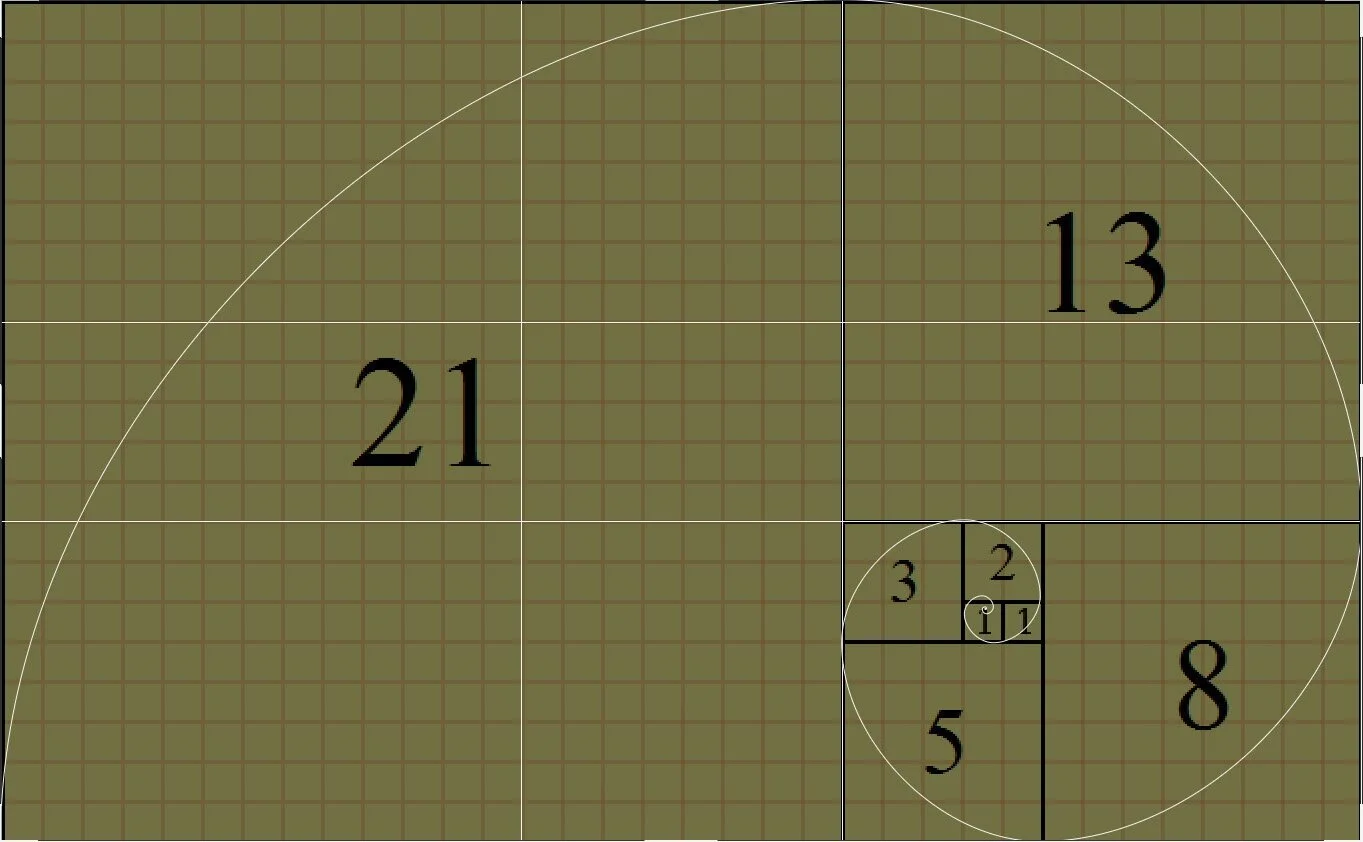
The pattern most commonly associated with the spiral and ratio is the Fibonacci sequence, wherein an integer is added to its previous integer to make the next number in the sequence; so, starting with an integer of 1, the pattern becomes:
0+1=1;
1+1=2;
2+1=3;
3+2=5;
5+3=8;
8+5=13;
13+8=21;
et cetera.
The first numbers in the Fibonacci sequence are therefore 1, 1, 2, 3, 5, 8, 13, and 21.
Graphing out the number sequence with square blocks representing each number (1x1 squares, then a 2x2 square, then 3x3, 5x5, 8x8, etc) builds a rectangle; the ratio of the rectangle’s length and height (or width, if you prefer) will be extremely consistent regardless of how large or small the rectangle becomes: approximately 1.618, or the golden ratio.
(Nerd bonus: the golden ratio is represented by the greek letter Phi, or Φ.)
And this has to do with composition… how?
Let’s apply the rule of thirds to the rectangle above, with the height of 21 blocks (the length of which is the next number in the sequence: 34); doing so creates three spaces of 7 blocks each. Vertical lines would separate the rectangle into equal spaces of 11.333 blocks each.
If the “rule of thirds” grid were adjusted to follow the golden ratio, however, it would look more like this:
Notice how the horizontal lines now create a top and bottom section of 8 blocks high, with a middle section of 5 blocks, and vertical lines separating the space into two sections of 13 blocks each (on the left and right) with a middle section of 8 blocks?
This grid separates the image space into proportions that are all based on the golden ratio. By placing your subject closer to its intersection points, the image can begin to feel subconsciously “right” and pleasing — all thanks to the proportions of space and distance between objects being similar to that which we see throughout all of nature.
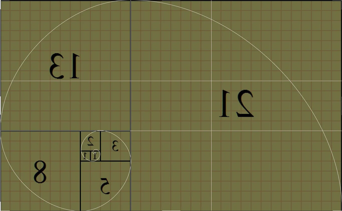
Regardless of where the grid’s numbers begin or which direction they grow, the ratio is (approximately) maintained.
But what about the spiral? How does it fit in?
Good question.
If you were to set a pen down on the image above at plot point “zero” (the top left corner of the left-most 1x1 box, in this case), drew a circular arc towards the opposite corner, then extended the arc into the next box and connected its two opposite corners, and continued expanding the spiral indefinitely, you then have the golden spiral.
In contrast with a grid approach to composition, the spiral pattern can often be the eye’s natural pattern of consumption of visual information.
When we look at an image, it’s unlikely that we inspect each section of the image in a grid pattern.
Do you look at the top left, then top middle, then top right; then middle left, then middle, then middle right, etc., of an image when you first view it?
Unlikely.
If the viewer’s eyes should be drawn to the subject of the image first, then as we search to contextualize the subject’s environment — our eyes radiating outwards and digesting the rest of the visual information provided — the pattern followed is most likely closer to a spiral motion than it is a grid-like dissection.
The inverse is also true: we can begin our visual journey in the space surrounding the subject, drawing closer into the subject as we follow the spiral down to its nexus.
This pattern is true regardless of where the focal point may begin:
You (hopefully) get the idea.
So does that mean I shouldn’t use the rule of thirds anymore?
Definitely not!
There are still plenty of use-cases to use the rule of thirds as the primary composition rule. Landscape photography, in particular, will generally use the rule of thirds to determine where to place a horizon line.
In fact, there’s no reason an image can’t be composed with the rule of thirds, the golden rectangle, and the golden spiral all in mind!
While the example here is a bit excessive, you can start to see how each type of compositional overlay could potentially be relevant to the image.
I’ve even thrown in a diagonal / triangular grid, which is also based approximately on the golden ratio; it shows that the path itself falls within the bottom triangle, with everything outside of that triangle providing supplementary information on the subject’s environment.
(Nerd bonus: why do I keep saying “approximately” when referring to the ratio? Because the ratio can actually often vary from section to section by fractional variations. 5 divided by 3 is 1.666…; 8 divided by 5 is 1.6; 13 divided by 8 is 1.625; 21 divided by 13 is 1.61538…; 34 divided by 21 is 1.61904…; etc.
As the integers increase in size and the spiral/rectangle expand, the ratio becomes further refined down towards the golden ratio.)
A layered approach to composition.
Perhaps you’d want to compose the environment around the subject with the rule of thirds in mind:
I’ve removed the subject from this image (via the magic of Photoshop’s content-aware fill) to show how the walking path winds its way roughly across the left vertical line, crossing both intersections.
The right two-thirds of the image are full of foliage, which informs the viewer that this environment is a wooded area.
The trees are then processed by the mind as being the “space” surrounding the subject, providing context to the subject’s whereabouts.
The left one-third of the image also contains trees, which further inform the viewer of the subject’s surroundings; however, the separation between these two sections is the path the subject traverses.
Once we add the subject back, we can then see how applying the golden triangle / golden spiral to the subject’s placement in the image and within the environment can peacefully coexist with the rule of thirds having been applied to the subject’s environment.
The spiral leads you to the subject, and then away into the environment.
You may notice, however, that the central point of the spiral is not exactly where your eye is first led to as it pertains to the subject. In fact, the spiral seems as if it’s been stretched a bit.
That’s okay!
Remember that these are guidelines, and that they can all be used in conjunction to compose your image. The spiral overlay is being applied within the confines of the aspect ratio of the image; since the image’s aspect ratio (4x5, or 8x10) does not conform to the golden ratio in this case, the overlay stretches out.
Your attention is most likely drawn to the subject’s head and back, around where her view would be gazing down the pathway.
The portion of the image above the view of the path and below the subject’s feet provide additional space for the subject, but are peripheral to the primary content of the image.
Once we adjust our golden spiral overlay to the proper aspect ratio (closer to 3x2 / 6x4), we see that the spiral now aligns more practically in relation to the subject.
The Takeaway
Hopefully you’re now familiar enough with the golden rectangle / ratio / spiral to consider it for your image composition.
Just keep in mind that there’s no “right” answer to how to compose an image. In our example above, the leaning of the trees towards the subject, as well as the path itself, are all leading lines which draw the eye towards the intended point.
Alternative composition guides are very useful in providing us with ways to break the “rules” of composition — which we should do at times to create more interesting stories with our images — while still following guidelines of aesthetically pleasing design.
Let’s look at one more image for an example.
In the picture to the right, the color guard member’s face is the focal point of the lens and falls on the top horizontal line in a golden rectangle grid.
The tuba is a secondary subject point, falling in the top left quadrant.
The boy looking at the girl is another secondary subject, also falling on a grid line.
Following the tuba, to the boy’s gaze, to the girl leads us in a spiral pattern — in this case the image focal point isn’t the nexus of the spiral, but is clearly along the outer edges of a properly ratio’ed spiral.
The remaining horn bells and the chevron of the uniforms create a leading line towards the primary subject.
Combined with the leading line created by the boy’s gaze, a triangle can be discerned which reaches an apex directly on our subject’s face.
It’s also useful to understand these guidelines for when we’re capturing subjects that perhaps don’t neatly fit into a grid — objects that are round or oval, or perhaps triangular.
Now it’s your turn!
Go out and experiment!
While most cameras do not provide grid overlays on the LCD or EVF, once you understand the relationship of the golden rectangle to the rule of thirds, you can use its lines to help approximate where the subject would fall on the golden rectangle or spiral.
Don’t be afraid to crop an image in post-processing either — it’s a powerful tool for recomposing a scene closer to your original vision if you weren’t able to get it just right in-camera / at the time you pressed the shutter button.


